Overview
In the rapidly evolving world of financial technology, the design and user interface of financial dashboards play a crucial role in delivering a seamless user experience to those in financial roles. Recognizing the importance of visual communication, our team embarked on developing an intuitive and effective color scheme for financial dashboards across the enterprise designed to cater to a diverse user base, ranging from individual investors to financial analysts in corporate settings and deliver consistent design patterns and color use across the enterprise.
The primary objective was to create a color scheme that not only enhances the aesthetic appeal of the dashboard but also aids in the effective presentation of financial data across the enterprise, making it accessible and understandable to users with varying levels of the the finance department.
Role
Design Lead, User Research, Visual Design
December 2023 and ongoing
Project Goals:
- Create a consistent color schemes across the enterprise
- Help drive quick seamless interpretation of dashboards to all users
Conducting the research
Our initial research involved gathering insights from potential users through surveys, interviews, and usability testing of existing dashboards. This phase highlighted the need for a dashboard that simplifies complex financial information using visual cues.
We delved into color psychology, focusing on how different colors affect perception and decision-making in a financial context. This understanding guided our selection of colors that evoke trust, clarity, growth, and caution.
Validating the designs
The color scheme was implemented in the development phase, followed by rounds of user testing to gather feedback. The responses were overwhelmingly positive, with users appreciating the intuitive use of color to navigate and interpret financial data.
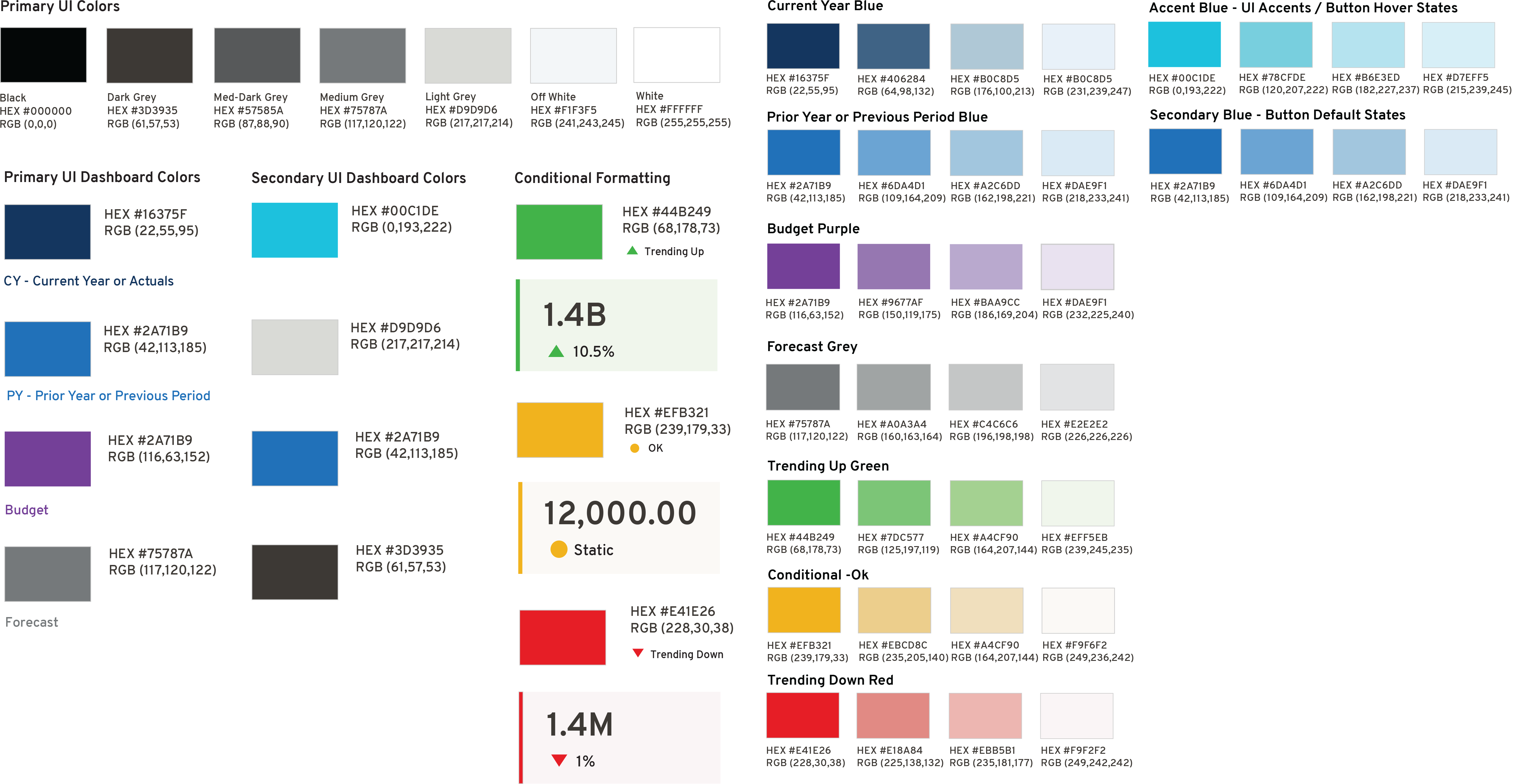
The Color Scheme
Blue: Trust and Stability
Use Case: Utilized for the dashboard background and primary navigation elements. Blue evokes a sense of trust and stability, essential in financial applications where users make crucial decisions based on the presented data.
Green: Growth and Positive Performance
Use Case: Applied to represent positive financial growth, such as profit margins and rising stock prices. Green highlights are used in charts and graphs to indicate upward trends, signaling positive performance to the user.
Red: Caution and Negative Trends
Use Case: Red is used sparingly to signify negative financial trends, such as losses or declining stock prices. Its use in dashboard alerts or as a highlight for downward trends in charts draws immediate user attention to potential issues.
Grey: Neutrality and Balance
Use Case: Shades of grey are used for background sections of charts and tables, providing a neutral backdrop that enhances the readability of financial data without causing visual fatigue.
Yellow: Attention and Warning
Use Case: Yellow is used for warning messages and to highlight key financial indicators that require user attention, balancing the need for caution without the urgency conveyed by red.
Outcome
A well-thought-out color scheme can significantly enhance user experience, facilitating better financial decision-making through effective visual communication.
The use of consistent color schemes in financial dashboards across the global enterprise plays a crucial role in ensuring clear and unambiguous communication of financial data, facilitating quick comprehension and comparison. It aids in the seamless interpretation of financial metrics and trends, enabling decision-makers to derive insights effectively and maintain coherence in financial reporting standards across diverse geographical locations. The success of this project underscores the importance of design in the financial technology landscape, where clarity, trust, and user engagement are paramount.